


We hired the talented Kendra Kuliga of Cielo Productions to design the logo. As the Art Director, I worked closely with Kendra who came up with this beautiful, highly versatile solution.
My process began by exploring the company’s vision, needs, goals, challenges, workflows, and competitors. We also put together a mood board and word map to identify themes and concepts we’d like to convey in the brand identity.
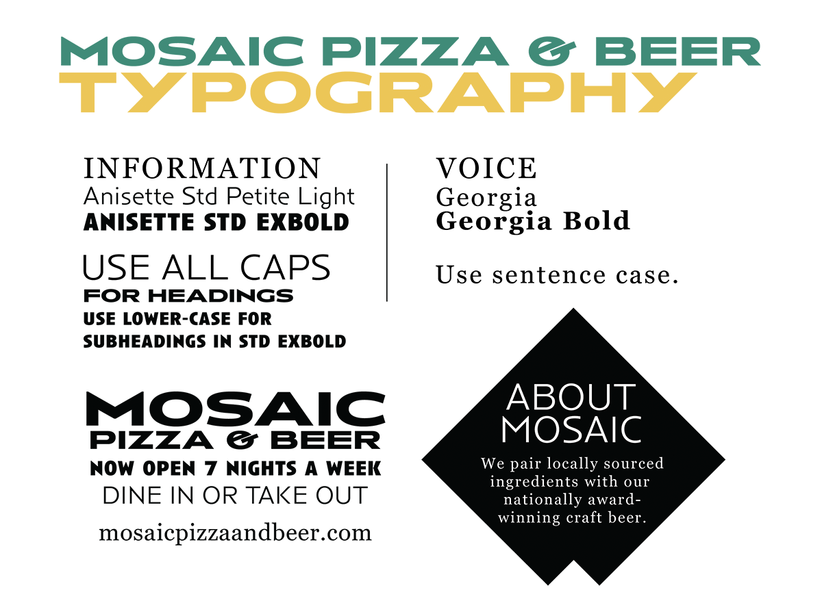
The selected type Anisette Std Petite which featured a distinct ampersand that separates the brand from a nearby competitor. This font paired beautifully with Georgia that was widely available for ease of use across platforms.
The color set was designed to imbue a sense of warmth and creativity. Aquamarine is vibrant, cool, and can lean blue or green, which is answered by the warm, grain-colored Saffron and a light orange tint called “Papaya Whip.” Together they presented a bright and upbeat tone. Integrating the distinct tile shape of the logo to make background patterns, icons, illustrations, and grids.
Integrating the distinct tile shape of the logo to make background patterns, icons, illustrations, and grids.
Creating on-brand pizza boxes was extremely important to the company, however budget constraints prohibited the team from purchasing custom packaging via traditional manufacturers. I remembered a clever lego-based method of block printing that I used to create cost-savings and art!